SunTrust Bank
There were many steps and parts to redesigning the entire SunTrust website. The main goal was to have a consistent experience on all pages for users, no matter which part of the site they were visiting.
Sitemap and Content Exploration
During the UX audit, I found that users were inundated with options when they opened up the main navigation and I identified 3 main tiers of pages and several sub-tiers that were one-off pages. I worked with the UX and Content team to identify the criteria used to evaluate the website. I also used these are the UX Principles to help guide the designs once we began wireframing. These principles guided not only UX, but also content management and the graphic design.
An Example of how I built a visual sitemap for the stakeholders.
Part of my role on this project was to educate project managers and stakeholders at SunTrust what UX and IA are and what the roles can do. Some of the stakeholders had difficulty understanding the sitemap and it’s purpose so I created a more visually exciting version so they could see all the actual pages and explore in Miro how they were connected.
The purpose of the UX audit was to identify components that could be reused, updated, and removed from the component library. I audited all the pages and navigation and shared my findings, observations, and considerations. I made sure that the presentation was understandable and educational.
Example of observations from the mobile viewport audit.
Simple | Relevant | Usable | Intuitive
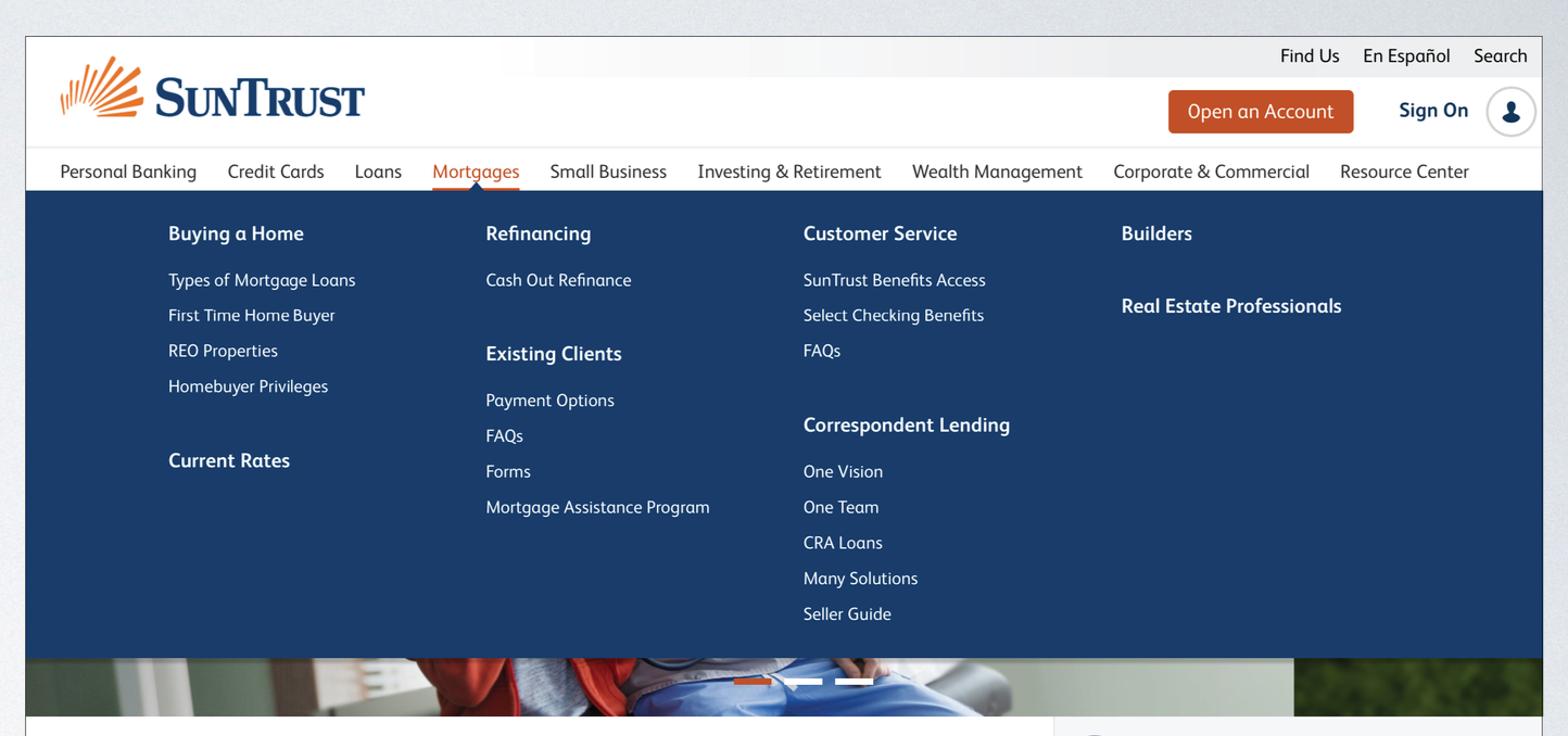
Sitemap and Main Navigation
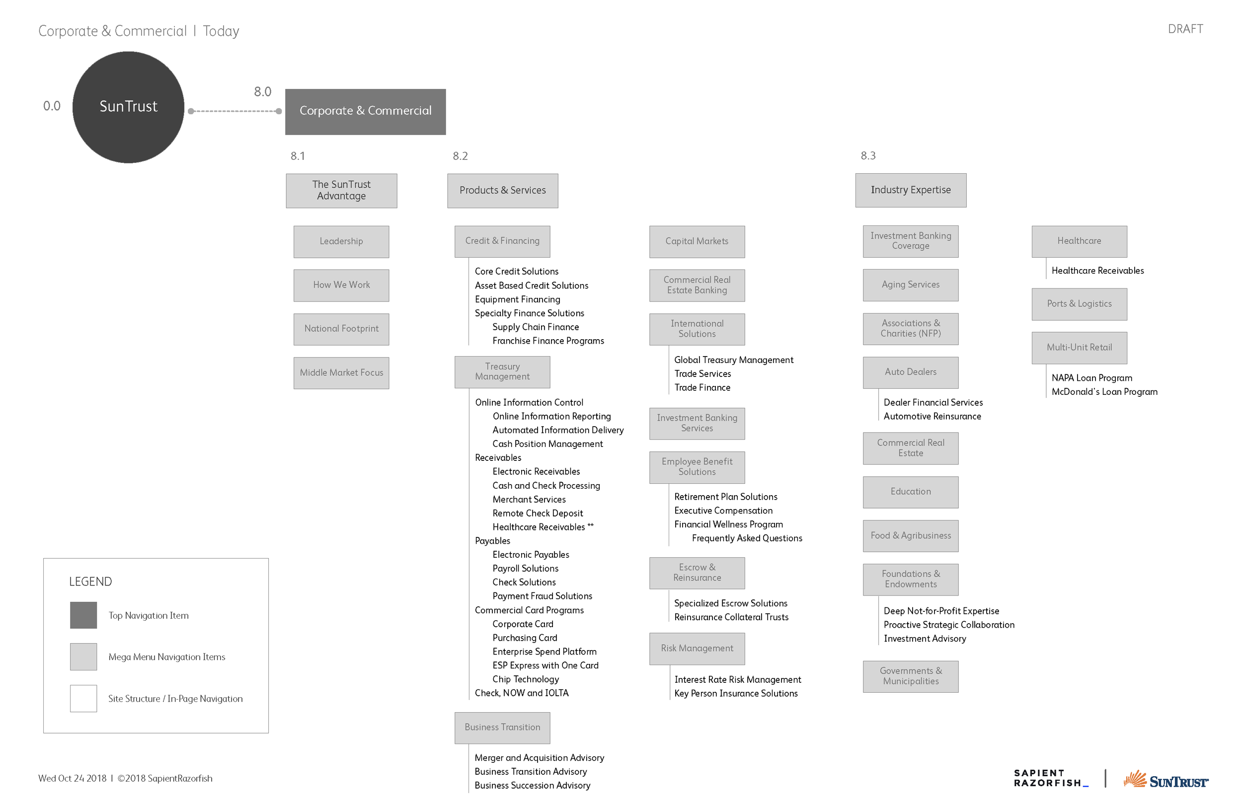
Existing/Old Sitemap
The old sitemap and navigation was confusing and overwhelming for users. The sitemap was difficult to scan and pages were somewhat disorganized. The main navigation took over a large portion of the page when it was opened. Users would sometimes accidentally click on the wrong page which led to frustration.

Proposed/New Sitemap
The new sitemap is easy to scan and easy to use. We also did extensive card sorting exercises to make the new sitemap and navigation intuitive. The new navigation would not show third level pages like the old navigation did so that users could get where they needed to go quickly.

Corporate and Commercial From initial design to Comps
Initial design and whiteboarding sessions led to simple wireframing and exploration of how filters and sorting would work.


These wireframes were iterated on and eventually approved by stakeholders. I made a total of 15 large viewport wireframes and 15 mobile viewport wireframes.
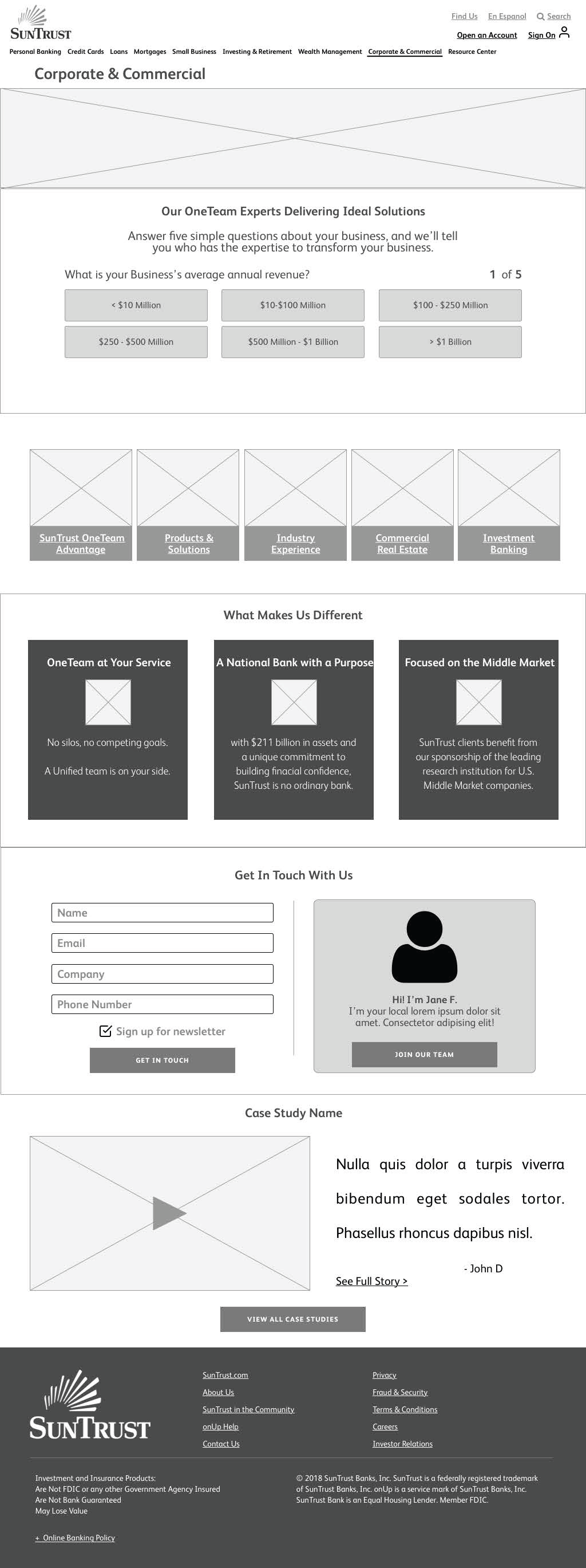

These are the final comps that were approved by the stakeholders. There are some minor differences between the final wireframes and the final design comps because there was no need to update the wireframes since I was annotating the final design comps for the offshore development team.